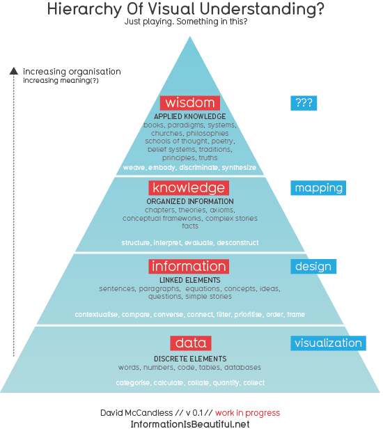
He asks whether there's anything in his brief thoughts here and I definitely think there is - there's also a load of visualisations that already exist based on the same flow of "data, information, knowledge, wisdom".
I'm not sure whether I agree with the title of the post though - I think this flow is less to do with visualising information and more to do with how our brains digest information. I also half agree with the upwards arrow on the left, I think it should be a measure of increased meaning - not organisation.
It looks like the red labels are being mapped to the blue labels by relating our non-visual understanding of information (red) to a visually aided understanding of information (blue). It's left fairly open to opinion by not including descriptions for the blue labels and I have a slightly different view.
So, starting with some data, four stages leading to a an increased understanding of the data in terms of visualisation would be:
First: data
I'm leaving the first level alone, coming from a computer science background, I feel data is important enough to me to have it's own level in this flow. There's lots that can be done to acquire, format and model data until it's ready for questions to be asked of it - not just by experts, but by anybody.
Second: grooming
The second level in the process would involve grooming the data so that the interesting bits start to stand out. What's the point of this data? Does the data interact with itself/can pieces of the data relate/compare to each other? What pieces of the data make for an interesting/worth-while visualisation?
Third: visualisation
With the data prepared in a clear-cut and easily digestible way for the designer/visualiser, the process of designing the visualisation can begin. Identifying areas of interest within the data in the second process will now play a part in choosing the visual aids for the visualisation such as shapes, sizes, colours and layout.
Fourth: knowledge
The outcome. A successful visualisation will have engaged it's audience successfully, told an interesting story and provided it's audience with a deeper understanding of the context of the data that would have been harder to digest without visualisation.
While thinking about these four stages, I kept wanting to bring in factors such as the time taken to understand the information and depth of understanding - showing the advantages and disadvantages between non-visual(red) and visually-aided (blue) flows. This makes me want to see/create my own inclusive visualisation of how we digest information when given visual aids - touching on the new data boom and the way data is designed to engage it's audience when a story is trying to be told.
I'm still in the early stages of learning about visualisation so my views on this will probably change soon, but this is what I envisage for the time being - and it's been enjoyable being my first properly reflective/opinionated post.
No comments:
Post a Comment