Transport for London have just released a set of APIs that return various types of transport information for the city. Below is a little bar chart of London tube stations using the Passenger count API. Looking forward to using the APIs in the future!
Showing posts with label Information. Show all posts
Showing posts with label Information. Show all posts
Tuesday, 16 August 2011

Tuesday, 17 May 2011
SVG-based, linked-data-driven chart widgets
In Feburary I was asked to have a pop at visualising some spending data for some local UK councils. The data was in linked data format (RDF/Turtle) - so stored in a RDF store somewhere and had the Linked Data API layered on top (the Puelia implementation).
The brief was to build an open-source, interactive, cross-browser dashboard of widgets; that would allow the comparison of council's spending data, say, per month.
After a little time spent researching, I came to the conclusion that RaphaelJS (an open-source JavaScript vector library) would fit the bill for this project nicely. The documentation wasn't great (I'm used to that though as I've been using theJIT library for previous visualisation work), but understandable enough to pick some of the demos apart and get the hang of how things worked within a few days.
The great thing about RaphaelJS is that it's simply a drawing library, so you can create a static SVG image of a banana or you can create a animated, multi-coloured, shape-shifting, real-time rotting banana, thanks to being able to manipulate and listen to events on the SVG DOM elements that form the vector image.
The brief was to build an open-source, interactive, cross-browser dashboard of widgets; that would allow the comparison of council's spending data, say, per month.
After a little time spent researching, I came to the conclusion that RaphaelJS (an open-source JavaScript vector library) would fit the bill for this project nicely. The documentation wasn't great (I'm used to that though as I've been using theJIT library for previous visualisation work), but understandable enough to pick some of the demos apart and get the hang of how things worked within a few days.
The great thing about RaphaelJS is that it's simply a drawing library, so you can create a static SVG image of a banana or you can create a animated, multi-coloured, shape-shifting, real-time rotting banana, thanks to being able to manipulate and listen to events on the SVG DOM elements that form the vector image.
Friday, 18 March 2011
Linked Data API - JSON endpoints
For developers who are familiar and comfortable with JSON - I've gathered a list of linked-data JSON API endpoints, to provide shallow waters (that can still attract the most colourful of fish!) for linked-data beginners.
Tuesday, 21 December 2010
A hierarchy of information digestion
Was just surfing around on the Information is beautiful website and came across a visualisation aimed at being a discussion starter by David McCandless on what he called "Hierarchy of visual understanding?".
He asks whether there's anything in his brief thoughts here and I definitely think there is - there's also a load of visualisations that already exist based on the same flow of "data, information, knowledge, wisdom".
I'm not sure whether I agree with the title of the post though - I think this flow is less to do with visualising information and more to do with how our brains digest information. I also half agree with the upwards arrow on the left, I think it should be a measure of increased meaning - not organisation.
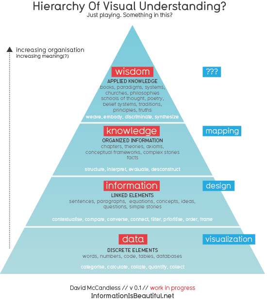
He asks whether there's anything in his brief thoughts here and I definitely think there is - there's also a load of visualisations that already exist based on the same flow of "data, information, knowledge, wisdom".
I'm not sure whether I agree with the title of the post though - I think this flow is less to do with visualising information and more to do with how our brains digest information. I also half agree with the upwards arrow on the left, I think it should be a measure of increased meaning - not organisation.
Saturday, 4 September 2010
David McCandless - Data Visualisation
"Information is the new oil" - I'll agree with that!
David McCandless is a journalist and shares his data-detective work with TED on the visualisations he's been creating. Really inspiring in terms of sparking the Sherlock within me and talks a lot of sense about how we may be consuming/designing information in the next few years. I'm over the moon to be in this line of work! Also ordered his book "Information is beautiful" which just arrived in the post :)
David McCandless is a journalist and shares his data-detective work with TED on the visualisations he's been creating. Really inspiring in terms of sparking the Sherlock within me and talks a lot of sense about how we may be consuming/designing information in the next few years. I'm over the moon to be in this line of work! Also ordered his book "Information is beautiful" which just arrived in the post :)
Subscribe to:
Posts (Atom)